BEAUTIFUL COLOR ELEMENTS DESIGN SPECIAL SPACES FINISHING STYLE SIMPLE KITCHEN ELEGANT

Wednesday, April 4, 2012

Rustic and Refined

         Laura Applegate spent months upon months mastering the mix that beautifully adorns the kitchen in the Los Angeles home she shares with husband Greg and two teenage sons. She traveled from cabinetmaker to stone quarry to glass store to tile studio and back again, selecting Spanish-influenced fittings and finishes that harmonized with her distinctive design vision and suited the Santa Barbara character of her under- construction home.
          During her journey, she worked with architect Scott Joyce and cabinetmaker Eric Fitucci to devise backdrops and a floor plan that accommodated her aesthetic preferences and her busy family's needs. Joyce had designed the residence for the property's previous owners, who sold the building site (complete with foundation) to the Applegates.
          “We fell in love with the ridge-top lot and Scott's plan for what was to be built," Laura says. "We did ask Scott to enlarge the opening between the kitchen and breakfast room and add doors from the breakfast room to the loggia. it was important to see through to the family room and to see or get outdoors from each area." Joyce‘s design incorporated clean-lined French doors, eyebrow windows, and arched doorways that direct the eye-and traffic-down hallways and between indoors and out. With the bones in place, Laura and Fitucci infused the kitchen with age-old forms and hardworking function.
       

          "I love Spanish style," Laura says. "I wanted the kitchen to be warm and rich, a little ornate, and with some color and lots of details. I love to cook and have people over, so Eric helped me devise a user-friendly layout and design cabinets with an old-world feel.
          " Fitucci designed cabinets with fine-furniture profiles that are arranged to optimize every inch  
of space. “We wanted the cabinets to be ornate without being over the top,” Fitucci says. "We used decorative moldings, seeded-glass panels, and beefy legs at the farmhouse sink and island to create the furniture look."
       The alder cabinet's intricate carvings and multitone finishes evoke high-end hacienda character, complemented by rustic tumbled-travertine floors and antique-white finishes that repeat on the paneled refrigerators and the island. Pretty and purposeful, the island is integral to how the kitchen looks and works. It supplies seating, houses a second sink and dishwasher, and provides a sweeping surface that connects the primary work spaces.
        "The big island gives me plenty of space for preparing and presenting food," Laura says. “Since we spend 95 percent of our time here, we needed somewhere at the island for all of us to perch. Having extended counters on two sides accommodates four stools, which we use a lot." Friends join the family at the island or sit nearby at the breakfast room banquette.
         The convivial kitchen and adjoining spaces combine for a wide- open great-room that offers a warm reception-a welcome that reflects Laura's personal aesthetic and hospitable personality. "Everyone loves the kitchen because it makes you want to come in and hang out," Laura says with a smile. "It‘s colorful, happy, and bright without being IDG much. It's a nice big kitchen with a strong visual connection to the outdoors. Every time I walk into the kitchen, I smile."  


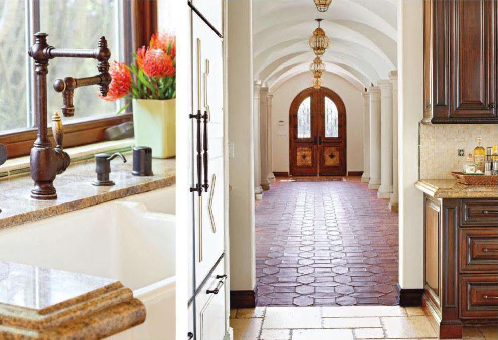
Oil-rubbed·bronze faucets and hardware complement the cabinet's Mission-brown and antique- white finishes and enhance the room's old-world character. The home's front entryway leads guests to the kitchen and previews its Spanish influences. Moorish-style amber pendants, wrought-iron door hardware, and Barcelona-inspired red-clay floors reference Santa Barbara style


Woven stools trimmed in leather add texture to the kitchen's work space. Separating breakfast and family rooms, paneled columns frame arches that rise above half-walls housing storage.

How to Make Contrast Work


Cabinetry designer Russell Dearsley shares tips on effectively mixing light- and dark-hue cabinetry.


Why this color palette?
Transitional style incorporates both dark and light colors for a sophisticated, serene look. All white would have been too much of one finish. For us, it's all about the mix. It allows us to experiment, and both materials look great with polished nickel and stainless steel.

The kitchen features a number of cabinetry styles, colors, and Finishes. How do you make it cohesive?
We mixed framed and unframed, raised-panel and flat-door profiles, then used stainless-steel drawer fronts to give the kitchen a transitional yet timeless look. Natural wood adds depth to the white. Polished- nickel hardware and trim under the countertops and around the range hood give the space fresh style and an elegant feel.

How did you mix dark and light tones effectively?
We used the darker cabinets as furniture pieces and limited their use to the island and refrigerator wall-—areas not evident as you walk into the kitchen. Using light colors for the countertops, a simple white backsplash, and having 1o—foot ceilings also helps. With lower ceilings. the space would appear darker- you simply wouldn't get the same effect.


Any other important factors in tonal balance?
High glass-front cabinets add sparkle, and polished-nickel hardware is a great way to add subtle shine. Metal also acts as a transition between dark and light.

SMOOTH TRANSITION


Stainless-steel drawer fronts near the cooktop add bling, and matching finishes on the range hood trim and drawer pulls unite disparate materials.


Frosted-glass insets at the top of the cabinets and corner shelves near the cooktop add storage and interest. A milk finish on the white cabinets gives them sheen and depth.


White marble on the island keeps the cabinetry from appearing heavy. Simple drawer pulls project a vintage look. Storage in the island makes it easy for the Dearsley children to access essentials. 


The fridge wall includes two refrigerators, as well as everyday and seasonal storage. A rolling ladder allows access to upper cabinets. 

         As vice president of sales for Downsview Kitchens, a Toronto—area cabinetry company, Russell Dearsley spends a lot of time in beautiful kitchens around the world. When it came time to design a kitchen for his own home, he needed an elegant yet efficient space that would stand up to the everyday use of his family, which includes his wife, interior designer Dina Mati, and two active children, ages 8 and 11. He also wanted the kitchen to function as a design lab and showroom where he could tty new ideas and materials.              Tossing out the standard kitchen that came with their new home, Russell and Dina tweaked the floor plan to make the room their own. Russell tackled space planning and the big picture; Dina focused on the fine finishes and distinctive details.                                                                                                                          “I make frequent trips to Europe and believe that a transitional style is where the high-end market is headed," Russell says. "It's a very sophisticated look, but one that is timeless, too.                                                  "Key to the look, he says, is a deft mix of materials-in this case, off-white perimeter cabinetry, a dark walnut island and storage wall, and polished-nickel and stainless-steel accents, which add sparkle and sophistication. The long marble-topped island serves as the 2.4x17-fopot room's visual anchor and provides both prep space and storage. The family opted to forgo a sink in the island to make the space function better as a buffet for entertaining the avid cooks host weekly meals for extended family. To keep the range wall symmetrical, they eliminated a walk-in pantry from the floor plan, instead using the wall space to house a coffeemaker and appliance garage. "W'e didn‘t feel we needed a walk-in pantry with all ofthe storage we were planning," Russell says.
         The couple also added a bay window and curved built-in banquette between the kitchen and adjacent family room. "We eat there, the kids do homework, and we play games there," Russell says. Opposite the banquette, a tall wall of cabinetry provides ample storage, and its rolling ladder—reminiscent of vintage libraries—is a conversation piece but also highly practical. "With ceilings getting higher and higher, it’s almost a necessity these days," he says. 
        The kitchen has more than rnet expectations—those of both the family and discriminating clients. "The space works very well for us,“ Russell says. As hoped, it has also served as inspiration for others. "I’ve had people come to me and say, ‘I want your kitchen,' right down to the island chairs. lt’s a huge compliment and a real measure of the kitchen’s success."


Durable quartz-surfacing on perimeter countertops matches the island's marble countertop color.


Simple light fixtures complement stainless- steel and polished-nickel accents.


Velvet- backed chairs at the island provide seating with a touch of sophistication.