Blessed with a big,
beautiful kitchen? Consider
the benefits of two islands.
In a two·cook kitchen,
many traffic jams can
be so avoided, but a
twin-island scenario is
not for everyone, says
Annie Graunke with
Martha O'Hara Interiors.
"Consider your lifestyle to
understand which scenario
works best," Graunke says.
Traflic Flow First
Make sure your floor
plan leaves enough space
between islands and
perimeter countertops to
accommodate food prep
and cleanup, Graunke says.
Her firm recommends aisles
at least 42 inches wide so
open appliance doors don't
impede traffic.
Function Follows
Understand how you'd use
the islands. If you entertain
often, you may want fridge
drawers and an icemaker
in the serving island,
Graunke says. A baker may
benefit from an island with
a lower counter for rolling
out dough. Place features
where they make sense, she
says. Homeowner Landyn
Hutchinson’s central work
island includes pullout trash
cans on the side closest to
the kitchen‘s main sink.
Strategic Storage
Two islands provide more
storage. Designate storage
that suits each island's
location, thinking of the
work zones nearby. Store
platters and serving pieces
in the island closest to the
dining room and cookware
in the island near the range.
Savvy Style
Having two islands doesn't
need to mean matching
looks, Graunke says-
especially if you're going
for a casual cottage style
that mixes finishes and
materials. In Landyn’s
case, she wanted the island
closest to the living room to
be decked out in furniture-
style details because of the
visibility. "Don't be afraid
to mix it up and make it
interesting," Graunke says.
Tuesday, April 17, 2012

Monday, April 16, 2012
All The Right Angles


The house had everything she desired—intriguing
design, plenty of room for her family of fave, a
good location in the same New York town they’d
lived in for years—but it also needed an overhaul,
beginning with the kitchen. "The previous owners,
they were big entertainers," Nikki says. “But I don’t
think they did much cooking."
The problem, Nikki says, was the home’s floor
plan. The front of the house featured a beautiful
space with big windows and a vaulted ceiling,
but it was all taken up by a huge dining room. The
adjacent kitchen lacked pizzazz, and that was a
problem. "I spend a lot of time cooking, so it was
really important to me to have a fantastic, state-of-
the—art kitchen," Nikki says.
So with the help of architect Rosamund Young,
the rooms switched places. The relocated kitchen,
designed by Mel Elion of Bilotta Kitchens in Mama-
roneck, New York, is long and tall, with the cook-
top at one end, a breakfast area at the other, and a
soaring ceiling in between. And yet it doesn’t feel
daunting. In fact, it feels very comfortable, Nikki
says. Two walls of windows make the space seem
larger than it really is.


On one long exterior wall of the kitchen, opposite a fleet of hardworking appliances, sliding glass doors bring the outdoors in, effectively widening the space while offering easy access to a small Japanese-style garden and the soothing sights and sounds of its pond and trickling fountain. Above the range, at the front of the space, is a triangular bank of sky-high windows, with the treetops they frame throwing splashes of green on the room’s neutral tones.
Everywhere, notes Elion, materials mix-walnut and marble, stainless steel and stone. And every- where, she says, geometry rules: in the play on proportions found in the cabinets; in the vertical columns that break the long wall; in the streamlined efficiency of the faucets and stools and overhead lights. "The room is modern , but it also has an earthiness to it," Elion says. "There are lots of luxurious features, but everything is functional."
Function, says Nikki, was key from the start, as she knew all along that this kitchen would be well- used. And so there’s plenty of storage ("I have so many gadgets, and I don't like seeing them all over the place"), abundant counter space ("my son does his homework in here while I'm cooking"), and all the amenities an avid chef could ask for ("I love the built-in coffeemaker"). Really, says Nikki, she lives here. "Take all the other rooms and leave me the kitchen. I’ll be fine."

A storage wail near the breakfast area includes tambour doors
that can be pulled down for a clean and modern look. A stainless-steel
countertop separates the TV. microwave, and coffeemaker from the
drawers and wine fridge below.

Homeowner Nikki Van der Vord
loves the side·by·side ovens. "I like how they‘re at face level." she says. “I
use them all the time." A warming drawer is hidden below. while the lift up cabinets above offer deep storage for cooking essentials.


Just beyond the breakfast area. with its tulip table and Bertoia chairs,
sliding glass doors access the koi garden. While the room has plenty of
windows, lighting design was important, as large trees limit natural light.
Monday, April 9, 2012
The Fridge Refined
Cover It Up
A fashionable cover-up once meant having a built-in
fridge with wood panels applied to the front. Today,
more and more manufacturers offer units that can be
fully concealed inside a custom armoire. "Almost every
fridge I do now is like a piece of furniture," kitchen
designer Bev Adams says. Unlike an integrated
built—in, an armoire can literally stand out. Any style
is possible, from Asian to country French. Drawers
are optional.
Go Modern
Many people like the sleekness of a stainless-steel
fridge. If sides are visible, wrap them with stainless
steel to play up the look, Adams suggests. Connecticut
designer Terry Scarborough likes to add matching
accents to the room-stainless·steel toe-kicks and
hardware, for example, or Parson-style steel legs on an
island. That way, Scarborough says, "the appliances
are part of the overall decor."
Go Bare
A commercial-style fridge with a glass door is a great way to showcase fresh ingredients and see contents at a glance. It fits a variety of settings, but it's not ideal if you dislike clutter or seldom clean your fridge. "I End it’s usually men who like this option," Adams says. When it comes to the fridge, "women like to cover up." Une caveat: Some commercial units are noisier than their residential counterparts.
Make It Lock Built-in
Sheathed by cabinetry, even a standard freestanding fridge can look built in-especially if it's at the end of a run with an equally deep cabinet or cubby above, A "counter-depth" fridge is shallower, but unless it's a true built-in, the doors still won't fit Hush with standard base cabinets. For a built-in look, you can recess the fridge, or bring adjacent base cabinets forward and increase counter depth.
A commercial-style fridge with a glass door is a great way to showcase fresh ingredients and see contents at a glance. It fits a variety of settings, but it's not ideal if you dislike clutter or seldom clean your fridge. "I End it’s usually men who like this option," Adams says. When it comes to the fridge, "women like to cover up." Une caveat: Some commercial units are noisier than their residential counterparts.
Make It Lock Built-in
Sheathed by cabinetry, even a standard freestanding fridge can look built in-especially if it's at the end of a run with an equally deep cabinet or cubby above, A "counter-depth" fridge is shallower, but unless it's a true built-in, the doors still won't fit Hush with standard base cabinets. For a built-in look, you can recess the fridge, or bring adjacent base cabinets forward and increase counter depth.
Sunday, April 8, 2012
Intersting Alternative : The Non-Kitchen Kitchen
You talk about designing a
"room you happen to cook
in." How does it differ
from traditional kitchens?
It's all about feeling. l like my kitchens to feel more like other rooms in a home— rooms that are comfortable to be in.
How do you achieve this feeling?
We've designed kitchens without upper cabinets; instead, we incorporate open shelves that can be used to display more than dishes- sculpture, perhaps.
What other elements make up the “non-kitchen" kitchen?
Such a kitchen feels very built-in. In this kitchen, for instance, one wall has a "hearth," which is the hood and windows. Another wall has a built—in Welsh cupboard, but it looks more like freestanding furniture. We always try to make room for seating so that people can literally sit in the kitchen. And most of the appliances are concealed.
How does the non-kitchen approach differ from more traditional approaches?
Rather than selecting a bunch of cabinets and organizing them, we design a room where you want to spend time, then outfit it with the cabinets and caseworks that support both comfort and function.

It's all about feeling. l like my kitchens to feel more like other rooms in a home— rooms that are comfortable to be in.
How do you achieve this feeling?
We've designed kitchens without upper cabinets; instead, we incorporate open shelves that can be used to display more than dishes- sculpture, perhaps.
What other elements make up the “non-kitchen" kitchen?
Such a kitchen feels very built-in. In this kitchen, for instance, one wall has a "hearth," which is the hood and windows. Another wall has a built—in Welsh cupboard, but it looks more like freestanding furniture. We always try to make room for seating so that people can literally sit in the kitchen. And most of the appliances are concealed.
How does the non-kitchen approach differ from more traditional approaches?
Rather than selecting a bunch of cabinets and organizing them, we design a room where you want to spend time, then outfit it with the cabinets and caseworks that support both comfort and function.

Sun-Washed Simplisity


Light pours in through tall windows that stretch up from countertop height. Custom cabinetry gives a built-in fridge and freezer a discreet presence, while stainless-steel surfaces downplay other appliances.

The custom Welsh cupboard displays favorite items, enhancing the room's comfortable appeal. An arched pass-through makes it easy to serve those in the adjacent family room/dining area.
Two active parents and three athletic teenage boys makes for a very hungry and busy-family that wants to make the most of their time together. A
big breakfast, cooked by a morn who likes things pared down and put away, is a
daily event in this Georgia home. So an accommodating kitchen in a comfort-
able, laid-back setting is a must.
According to architect Peter Block, the room called for Belgian sensibility.
"When you look at the things the Belgians do, you notice a clear order," he says.
"The kitchen is very clean in its design, but there's a richness to it that comes
from the details and quality materials used."
The shiplap boards, for instance, rise three-quarters up the walls, providing a
flexible barrier that blocks any bangs from passing lacrosse sticks. And the rich
patina on the boards harkens back to the look of old farmhouse wood suited to
the home's English country style.
In addition to the shiplap boards, Italian plaster walls contribute soft texture.
"The pigment in the plaster is actually ground-up limestone dust, and it's color-
fast," Block says of the living, breathing surface, which hardens with age. “Old
houses were built with plaster. It adds a level of authenticity."
The kitchen's tall windows bathe the walls in light most of the day, bringing
out the plaster's natural coloring. "The effect is luminous? says Beth Webb, the
designer on the project. “You walk in and ask yourself why it looks different. It's
hard to put your finger on it."

A wood side table with casters, a plank shelf, and hammered nailhead trim provides an extra serving surface where needed.

In keeping with the kitchen's clean lines, cabinet doors and drawers are inset and hush with the face frame. Square knobs are dimpled and easy to grab.

The range is topped with a clean-lined plaster hood that suits the room's neutral but elegant style.

Stain, glaze, and distressing gives the Welsh cupboard an aged feel, as does dark metal hardware with ring pulls.
Wednesday, April 4, 2012
Rustic and Refined


Laura Applegate spent months upon months
mastering the mix that beautifully adorns the
kitchen in the Los Angeles home she shares
with husband Greg and two teenage sons. She
traveled from cabinetmaker to stone quarry to
glass store to tile studio and back again, selecting
Spanish-influenced fittings and finishes that
harmonized with her distinctive design vision and
suited the Santa Barbara character of her under-
construction home.
During her journey, she worked with architect
Scott Joyce and cabinetmaker Eric Fitucci to devise
backdrops and a floor plan that accommodated
her aesthetic preferences and her busy family's
needs. Joyce had designed the residence for the
property's previous owners, who sold the building
site (complete with foundation) to the Applegates.
“We fell in love with the ridge-top lot and Scott's
plan for what was to be built," Laura says. "We
did ask Scott to enlarge the opening between the
kitchen and breakfast room and add doors from
the breakfast room to the loggia. it was important
to see through to the family room and to see or get
outdoors from each area."
Joyce‘s design incorporated clean-lined French
doors, eyebrow windows, and arched doorways that
direct the eye-and traffic-down hallways and
between indoors and out. With the bones in place,
Laura and Fitucci infused the kitchen with age-old
forms and hardworking function.
"I love Spanish style," Laura says. "I wanted the kitchen to be warm and rich, a little ornate, and with some color and lots of details. I love to cook and have people over, so Eric helped me devise a user-friendly layout and design cabinets with an old-world feel.
"
Fitucci designed cabinets with fine-furniture
profiles that are arranged to optimize every inch
of space. “We wanted the cabinets to be ornate without being over the top,”
Fitucci says. "We used decorative moldings, seeded-glass panels, and beefy legs
at the farmhouse sink and island to create the furniture look."
The alder cabinet's intricate carvings and multitone finishes evoke high-end
hacienda character, complemented by rustic tumbled-travertine floors and
antique-white finishes that repeat on the paneled refrigerators and the island.
Pretty and purposeful, the island is integral to how the kitchen looks and
works. It supplies seating, houses a second sink and dishwasher, and provides a
sweeping surface that connects the primary work spaces.
"The big island gives me plenty of space for preparing and presenting food," Laura says. “Since we spend 95 percent of our time here, we needed somewhere at the island for all of us to perch. Having extended counters on two sides accommodates four stools, which we use a lot." Friends join the family at the island or sit nearby at the breakfast room banquette.
The convivial kitchen and adjoining spaces combine for a wide- open great-room that offers a warm reception-a welcome that reflects Laura's personal aesthetic and hospitable personality. "Everyone loves the kitchen because it makes you want to come in and hang out," Laura says with a smile. "It‘s colorful, happy, and bright without being IDG much. It's a nice big kitchen with a strong visual connection to the outdoors. Every time I walk into the kitchen, I smile."
"The big island gives me plenty of space for preparing and presenting food," Laura says. “Since we spend 95 percent of our time here, we needed somewhere at the island for all of us to perch. Having extended counters on two sides accommodates four stools, which we use a lot." Friends join the family at the island or sit nearby at the breakfast room banquette.
The convivial kitchen and adjoining spaces combine for a wide- open great-room that offers a warm reception-a welcome that reflects Laura's personal aesthetic and hospitable personality. "Everyone loves the kitchen because it makes you want to come in and hang out," Laura says with a smile. "It‘s colorful, happy, and bright without being IDG much. It's a nice big kitchen with a strong visual connection to the outdoors. Every time I walk into the kitchen, I smile."

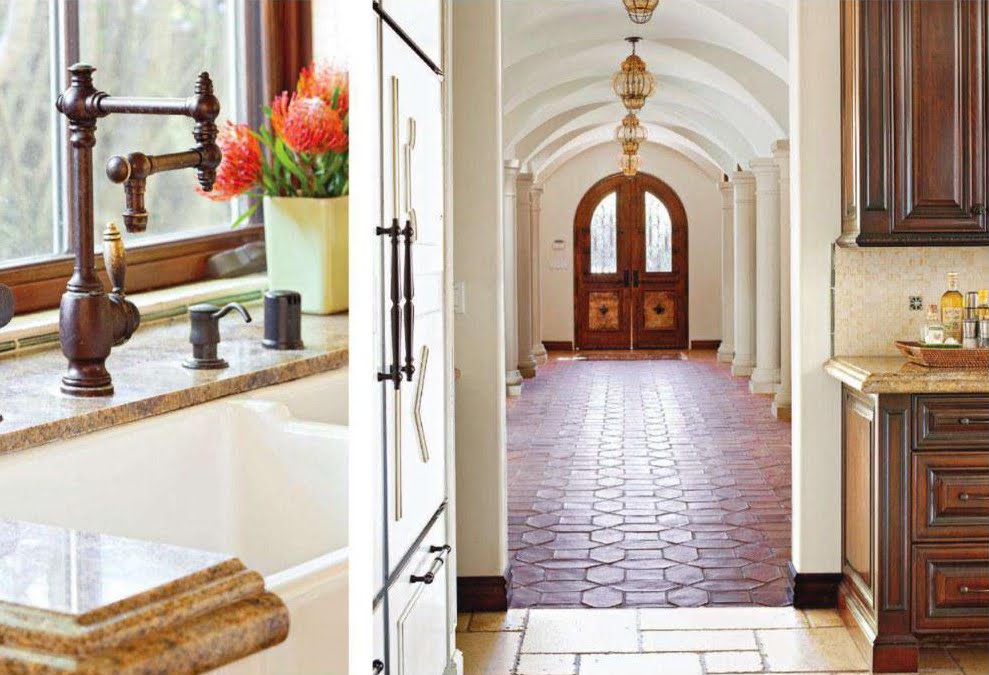
Oil-rubbed·bronze faucets and hardware complement the cabinet's Mission-brown and antique- white finishes and enhance the room's old-world character. The home's front entryway leads guests to the kitchen and previews its Spanish influences. Moorish-style amber pendants, wrought-iron door hardware, and Barcelona-inspired red-clay floors reference Santa Barbara style

Woven stools trimmed in leather add texture to the kitchen's work space. Separating breakfast and family rooms, paneled columns frame arches that rise above half-walls housing storage.
How to Make Contrast Work

Cabinetry designer Russell Dearsley shares tips on effectively mixing light- and dark-hue cabinetry.
Why this color palette?
Transitional style incorporates both dark and light colors for a sophisticated, serene look. All white would have been too much of one finish. For us, it's all about the mix. It allows us to experiment, and both materials look great with polished nickel and stainless steel.
The kitchen features a number of cabinetry styles, colors, and Finishes. How do you make it cohesive?
We mixed framed and unframed, raised-panel and flat-door profiles, then used stainless-steel drawer fronts to give the kitchen a transitional yet timeless look. Natural wood adds depth to the white. Polished- nickel hardware and trim under the countertops and around the range hood give the space fresh style and an elegant feel.
How did you mix dark and light tones effectively?
We used the darker cabinets as furniture pieces and limited their use to the island and refrigerator wall-—areas not evident as you walk into the kitchen. Using light colors for the countertops, a simple white backsplash, and having 1o—foot ceilings also helps. With lower ceilings. the space would appear darker- you simply wouldn't get the same effect.
Any other important factors in tonal balance?
High glass-front cabinets add sparkle, and polished-nickel hardware is a great way to add subtle shine. Metal also acts as a transition between dark and light.
SMOOTH TRANSITION

Stainless-steel drawer fronts near the cooktop add bling, and matching finishes on the range hood trim and drawer pulls unite disparate materials.

Frosted-glass insets at the top of the cabinets and corner shelves near the cooktop add storage and interest. A milk finish on the white cabinets gives them sheen and depth.
White marble on the island keeps the cabinetry from appearing heavy. Simple drawer pulls project a vintage look. Storage in the island makes it easy for the Dearsley children to access essentials.
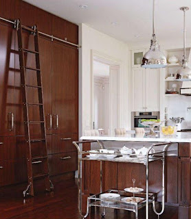
The fridge wall includes two refrigerators, as well as everyday and seasonal storage. A rolling ladder allows access to upper cabinets.
As vice president of sales for Downsview Kitchens, a Toronto—area cabinetry
company, Russell Dearsley spends a lot of time in beautiful kitchens around
the world. When it came time to design a kitchen for his own home, he needed
an elegant yet efficient space that would stand up to the everyday use of his
family, which includes his wife, interior designer Dina Mati, and two active
children, ages 8 and 11. He also wanted the kitchen to function as a design lab
and showroom where he could tty new ideas and materials.
Tossing out the standard kitchen that came with their new home, Russell
and Dina tweaked the floor plan to make the room their own. Russell tackled
space planning and the big picture; Dina focused on the fine finishes and
distinctive details.
“I make frequent trips to Europe and believe that a transitional style is where
the high-end market is headed," Russell says. "It's a very sophisticated look, but
one that is timeless, too. "Key to the look, he says, is a deft mix of materials-in this case, off-white
perimeter cabinetry, a dark walnut island and storage wall, and polished-nickel
and stainless-steel accents, which add sparkle and sophistication. The long
marble-topped island serves as the 2.4x17-fopot room's visual anchor and provides
both prep space and storage. The family opted to forgo a sink in the island to
make the space function better as a buffet for entertaining the avid cooks host
weekly meals for extended family. To keep the range wall symmetrical, they
eliminated a walk-in pantry from the floor plan, instead using the wall space to house a coffeemaker and appliance garage. "W'e didn‘t feel we needed a walk-in
pantry with all ofthe storage we were planning," Russell says.

The kitchen has more than rnet expectations—those of both the family and
discriminating clients. "The space works very well for us,“ Russell says. As
hoped, it has also served as inspiration for others. "I’ve had people come to
me and say, ‘I want your kitchen,' right down to the island chairs. lt’s a huge
compliment and a real measure of the kitchen’s success."

Durable quartz-surfacing on perimeter countertops matches the island's marble countertop color.
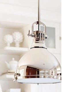
Simple light fixtures complement stainless- steel and polished-nickel accents.

Velvet- backed chairs at the island provide seating with a touch of sophistication.
Tuesday, April 3, 2012
Beautiful Kitchens and Baths

Sink wall about 5 feet. Ceiling beams were added and hand-distressed with chains by the entire Juergens family-to complement the big chestnut column by the Fireplace (not shown).
Maria Juergens knew just what she wanted. "A modem kitchen with all the conveniences, but not one that looked new," she says. "I wanted a beautiful kitchen that wouldn't look out of place in our 1919- era house.“ And then she saw it: "In a magazine-it was bright, cheery, and had this old, English charm." Maria describes her home as a "pretty, Southern- type of house," one of many in an older part of Knoxville, Tennessee. Her original kitchen was tiny, so she hoped to expand. But size, she says, was less important than style. "Maintaining the architectural integrity of the house was critical to me," she says. "I didn't want it to look like an addition."
With that in mind, and with designer Heather
Hungeling standing with her at the helm, the
renovation began. Before long, they'd bumped out
an exterior wall 5 feet and demolished a closet to
reveal an aging brick fireplace. “We also widened
the opening between the kitchen and the adjacent
family room," Hungeling says. "Even with the
expansion, the kitchen was going to be small, and
we really wanted to include an island. So, the idea
was to open the space up as much as possible."
The new room is "very open and inviting, but
not in that big, contemporary way," Maria says. Her
new marble countertops are beautiful, and she loves
the strikingly old-fashioned look of her European-
made range. In the recessed cooking niche-capped
with a stately mantel a delft blue-and-white-tile
backsplash features pretty, hand-painted scenes
of the countryside. Flanking it, delicate mullioned
cabinets seem to float above the countertops.
The fnrcelay apron sink was handmade in
England, while to its left, and arm's reach away, a
built-in plate rack occupies its own corner in the
upper cabinets. "The rack harkens back to an earlier
English kitchen," Hungeling says. "You would wash
your dishes and place them there to dry."

A storage wall, with a central built-in refrigerator and pantries on either side, keeps the kitchen clutter-free. Floor-to ceiling pilasters add Victorian flavor and texture to the space.

Maria wanted a bright, cheerful kitchen, Antique cream on the walls, white marble countertops. and abundant natural light did the trick.
With the exposed brick of the fireplace, the distressed wood beams that cross the ceiling, the hardwood flooring salvaged from an old distillery, and the distinctly English color palette- a cream that Hungeling describes as “antique"-the space has become everything Maria hoped it would. “It's sunny," she says. “It's warm and cozy, full of character, and it feels old. It fits the house perfectly." And then there's the island, with its gentle curves, its dark teak top, and its tidy prep sink a spin from the range. “We managed to fit it in," Hungeling says, "but it wasn't easy." Maria, for her part, says her new island-her original kitchen lacked one-is indispensable. “I can make dinner there and watch my kids as they're doing homework in the family room. It may be small, but I use it all the time, and I love it.“


Materials mingle: white Calacatta gold marble countertops, a fluted fireclay sink. and cream cabinets with brass knobs.

The renovation unearthed an old fireplace that limited the opening between kitchen and family room, and Maria chose to keep it.
What new high-style kitcheh or beth dcesh’t deserve a bit of the Midas tcuch?

1. THG's newest faucet collection features handles by Daum, a handcrafted crystal firm founded in 1878. The Sun Dragon washbasin faucet boasts a sinuous faucet in polished brass and amber-color handles that remind us of coral.

2. A fresh take on the traditional sunburst design. this mirror is a signature piece with a. distinct presence. we like the effect. wouldn't you like to gaze into this gilded beauty as it gleams on your own dream-bath wall?

3. Comfortable in either a kitchen or bath, the Bijoux sconce is formed from handcrafted iron and finished in silver leaf. Inspired by the drama and dress of a Paris cabaret. the sconce is dripping in crystals. Who doesn’t love a little dignified bling?

4. We often describe hardware as the jewelry of a room, and from that perspective, this knob is a multicarat rock. Add it strategically to bath cabinetry. and your daily ablutions will take on significant sparkle.
How does the size of the kitchen affect the color palette choices?
Most people think a large kitchen can accommodate a
lot of color, but I feel that too much color in a large space
can be overwhelming, in such a setting, the space itself
provides Plenty of drama, so I often use a more delicate
palette to keep the overall impression in scale, in smaller
kitchens, you can have more Fun with color because the
space functions much like a piece of art thats viewed singly
and in its totality.
Are there any ether factors that play a part in the color decisions for a kitchen?
The home's architectural style and its location are the
most obvious elements we consider as we put together a
design and color palette. For instance, in a historic Baton
Rouge home, where many of the materials are natural
or reclaimed, we're recommending a classic French
palette with Mediterranean influences. For a home in the
Hamptons, a white kitchen works perfectly. The kitchen's
color palette is 100 percent project-specific. Designs and
colors are chosen that make sense with what we're trying
to achieve.
So the right presentation really makes a difference?
Yes, absolutely, but clients are slowly becoming more
accepting of color, too. In the early 'gos. an adventurous
client might choose a creamy yellow cabinet instead
of white, and thats as far as it would go. Now l'm seeing
more combinations of color. The willingness to take that
approach began with the trend to give the kitchen island
a different color treatment than the perimeter cabinets.
Now that's feeling overdone. But as confidence in using
color grows, bolder steps are being taken. Homeowners
are opera to lacquered cabinets and grayer shades of oak.
They're experimenting far more now than in the past.
Are there other ways you help clients become more adventurous with color?
Homeowners hire a designer because they want their
kitchen's potential to be fully realized. They're seeking
ingenious solutions, thoughtful ideas, and a clear picture
of how their kitchen will look and perform. So when we as
designers present a comprehensive overview that includes
cabinet door, countertop, backsplash, flooring, and paint
samples, as well as a detailed color rendering. they see
how each element works with others. and they understand
how introducing color adds visual interest and variety.
How do you and your clients arrive at the perfect color palette for kitchen?
While few clients have a definitive color palette in mind at
the start of the planning process, they are often hesitant
about venturing too far afield from a white or otherwise
neutral palette. We take that opportunity to quietly
encourage them to explore more options. There may be,
for instance, a color that appears in other rooms in their
home. a color they are clearly comfortable with. That color
might serve as inspiration in the kitchen palette. And, too,
the palette frequently evolves as the design evolves.
ANTICIPATE LOVING YOUR KITCHEN
The process will be long, rigorous, joyful at times,
frustrating at others. Some decisions will be no
-brainers, others will be agonizing. But in the end,
you'll have a kitchen that suits your personal
style in a way that no spec kitchen ever could.
Meadors explains it best: "Success? That's when
the client says. We're completely in love with
the kitchen. We feel like we thought of all this."
And as for the team, you cant remember all the
hours you put into searching for the best answers
because you feel so good about the final results."
PARTICIPATE IN THE PROCESS
As Merrell explains: "The best kitchens are the
ones where clients fully participate in the design
process" So never assume you are a silent
member of the team, Prestwood says. "You need
to understand the implications of the decisions
you're making] he says. "Your duty is NOT to
make our lives easier or to speed the process
along."
MAINTAIN A DIALOGUE WITH A TRUSTED TEAM MEMBER
Your chief point of contact may be the team
leader or the pro you know the best. In either
scenario, you need to trust this person to keep
you fully informed. "He or she needs to show
you how the team is meeting your expectation
of selections and show you that everything is on
schedule," Meadors says. "He or she moods to
reinforce your confidence in the team."
COUNT ON INFO BEING SHARED
With something as complex as a kitchen, errors
can happen. But the number of mistakes can
be reduced with direct lines of communication.
Face-to-face conversations and on-site meetings
help make sure everyone is on the same page.
"We try to do the lion's share of design and
refinement with everyone in the room at the
same time," says architect Bill Prestwood. "That
way we make sure everyone is in agreement."
When time is of the essence, however, e—mail
and smartphones often make everyone's lives
easier. "Send everybody the sketch, get a quick
response from every team member, and by the
next day, we've solved it," Plowden says. But
be careful, Prestwood warns: With e-mail, the
opportunity for misinterpretation grows.
Be Aware of Rough Spots
Here's how you know
when things are going
well: Everyone feels
a sense of ownership.
Meetings involve frank
discussions of budget,
Schedule, and problems.
Team members respond
promptly to action
items. And there's
a vibe, Fenno says,
because everyone is
excited by the ideas
being discussed.
But sometimes things
don't go so smoothly.
Our panel of experts
identified some red
Bags that let you know
an intervention might
be needed.
• The team gives you a
plan without asking for
your input.
• You're surprised by
construction details.
• Contractors don't have
the information they
need to move forward.
• You make a phone
call and it doesn't get
returned.
• Team members aren't
communicating with you
or each other.
• You feel clueless or
don't understand the
conversations going on
around you.
• Every other week you
ask, "Why haven't we
gotten this done yet?"
Subscribe to:
Posts (Atom)